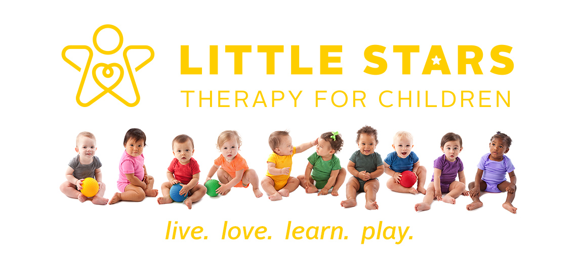
Back
Brand Bumper Brand Identity

Little Stars

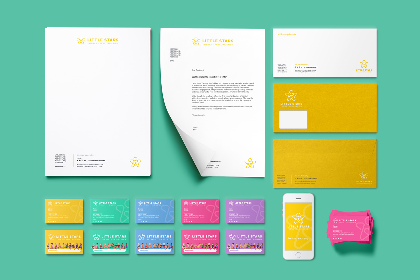
Little Stars, Therapy for Children is a comprehensive specialist service based in Maidstone, Kent, focussing on the health and wellbeing of babies, toddlers and children. With therapy, their aim is to optimise physical function to maximise engagement, integration and participation in day-to-day activities and most importantly your child’s occupation… play!

They are proud to be able to offer specialist assessment, advice, support, therapy and treatment in environments where children live, love, learn and play.

Task

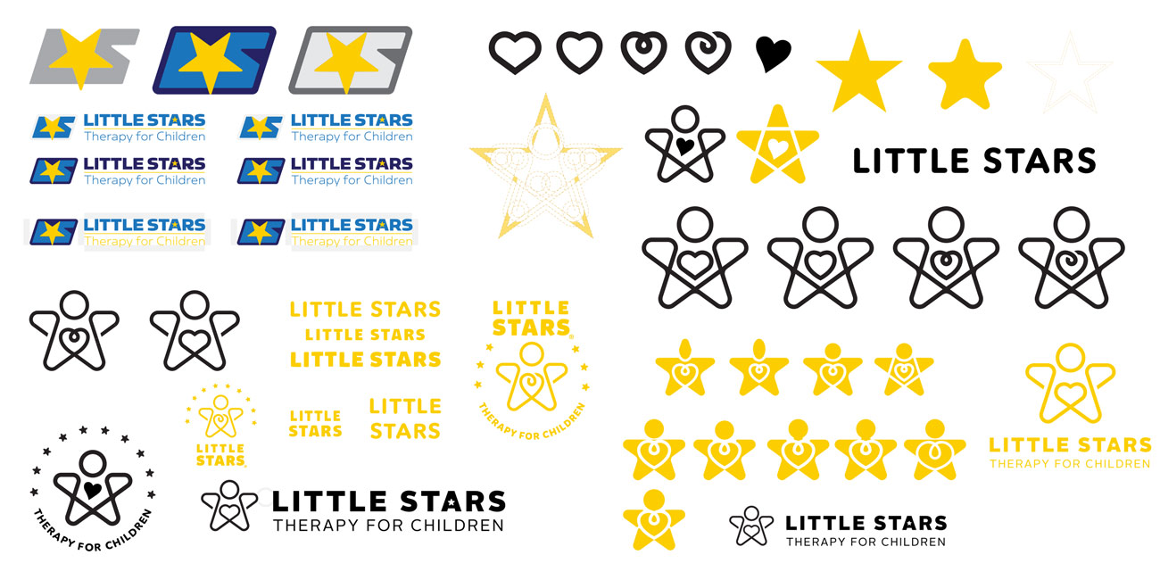
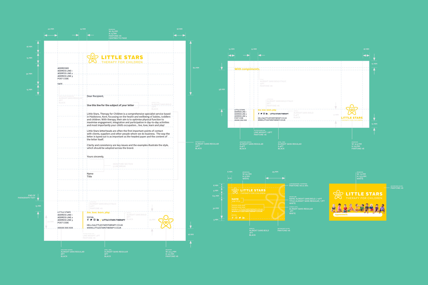
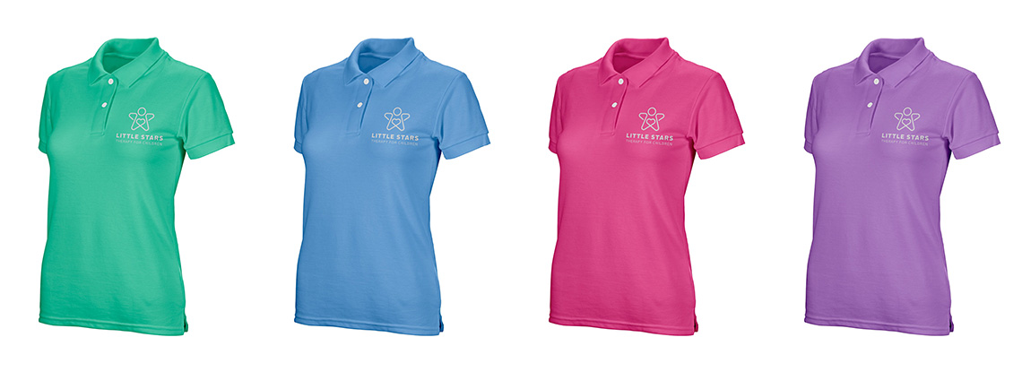
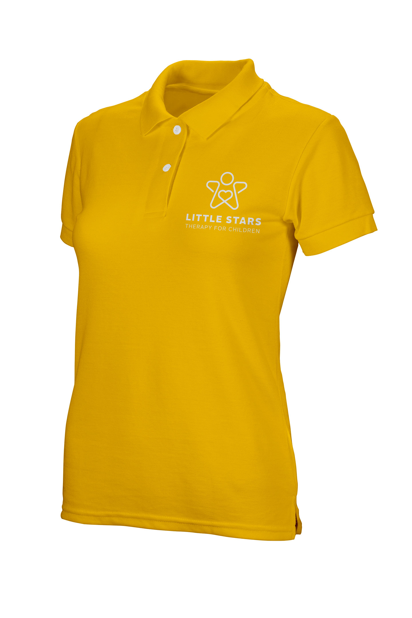
Little Stars challenged me to create a unique brand experience incorporating a star theme that could easily identify their approachable and child-friendly services.

  • Strategy

    Brand identity, Print & digital Comms, Animated Brand bumper

  • Client

    Little Stars

The solution.

Design approach.

We were over-the-moon at the chance to capture the magic of Little Stars. Through our brand strategy research, we identified the importance of creating a child-friendly star character and incorporating a heart symbol into the design concepts to signify the health benefits of their key services, through visual simplicity.

BRANDMARK.
I designed a brandmark that fuses a star, heart and a gender-neutral character – focussing on the key brand values of the company. The logo is approachable, friendly, colourful – harmonising all of the aspects of our research strategy.

I chose one extensive typeface family to feel all-inclusive and picked a primary colour scheme, to form the core of a lively, gender-neutral palette.

The layout grid showcases how the logo mark has been made to clarify the precise structure and layout.

Like anything, good design needs structure and a strong foundation to keep the logo visually consistent through all print and digital collateral.

Secondary brandmarks.

Animated brand bumper.

I created a brand bumper for Little Stars – a short animated logo reveal in 10 seconds. It emphasises the brand story through a professional, colourful animated perspective.

Typography.

I selected the Alright Sans family of typefaces for the Little Stars branding, it brings consistency and approachable professionalism to the brand identity. Thin, Light, Regular, Medium, Bold and Black weights are appropriate. It is the preferred typeface for all print and digital media.

In circumstances where Alright Sans cannot be used due to technical constraints, Monserrat is the acceptable substitute – available to download through google fonts. This may include email and office communications.

I helped Little Stars tell their story through a bold new brand identity experience.

Stationery literature.

Little Stars stationery is often the first important point of contact with customers and suppliers. The way the company information is presented is as important as the content of the stationery itself. Clarity and consistency are key issues to illustrate the style, which are adopted across the brand.

I created letterheads, compliment slips, multi-design business and appointment cards and envelopes that were designed with the brands core values.

Apparel.

I designed a vibrant uniform solution for Little Stars, showcasing all of the primary colour palette and logo. The dri-fit polo shirt has been selected to showcase a professional and approachable look, that is comfortable to wear for the team member, whilst also bright and colourful, appealing to the infant patients.

Let's talk.

Need help with a project?

We’d love to hear about your brand and business challenges, even if you’re not sure what your next step is.

Get in touch and let’s create something great. together.